The last two years have taught us how unpredictable the world of design can be. Simplicity is trendy, retro is back, and things that were formerly considered outdated are becoming fashionable again. Brands are reimagining old designs and trying to keep up with the latest creative logo design trends.
The pace at which the world has changed in recent years has made us nothing but wiser and more adaptable to new perspectives and challenges. So, whether you begin a new business or update your existing logo, your logo represents you and accurately expresses your brand identity.
Are you looking for new logo design trends to revamp your logo?
Here are 7 logo design trends that you wouldn’t want to miss;
The Most Popular Trends in Logo Design Right Now:
3D Logos
Do you know how watching a Marvel movie in 3D is never a bad decision? 3D logos are no less than that. Logos in 3 Dimensions always create a great impact on the audience. As compared to 2D logos, 3D logos stand their own ground and are creatively distinct.
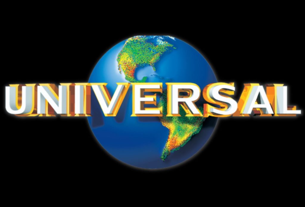
3D logos are gaining a more sophisticated look. Contoured edges, slight blur, shadows, and gradients may very well be used to alter your logo in an indistinct and significant way. Adding depth and perspective is a brilliant and eye-catching approach to grabbing your audience’s attention. Keep your 3D logo light-basic, and only use it as part of the overall design to keep it looking new and fresh.
Bright Colors
Google recently updated Google Chrome’s logo. There was no apparent change in design. However, a visible change could be noticed in the colors of the logo of the browser. The colors were brighter and more vibrant than the ones chrome had, previously.
Brightly colored logo designs are popular because bright colors are easily seen on a computer or mobile device. Excitement, optimism, enthusiasm, and enjoyment are all conveyed via vibrant color patterns. It is better to utilize eye-catching and vivid colors to differentiate your brand from your competition while interacting with clients online through your logo. You will also be able to capture customers’ attention if you use bright colors immediately. On the other hand, colors should be consistent with your brand identity.
 Typography
Another logo design trend is taking the spotlight again. Wordmark logo designs are where the letters of the logo reflect the brand characteristics. These logos are divided into two types: those in which the typography dominates the picture and gives the logo an iconic symbol design, and those in which the text is snuggled inside the artwork and gives it shape and structure.
We can observe how text and images function together in these logos. They’re not like logos with titles written apart from the image; in these, the text is essential to comprehending the visual.
Monograms
Monograms are one of the evergreen logo design trends that have been in sight for a long time now.
A monogram logo is a symbolic representation in very few letters, frequently employing only the initials. As a result, it comprises only one or two letters in a creative design. Typography plays a significant role in making monogram logos unique and effective.
Asymmetric Logo Design
When handled successfully, asymmetry provides a welcome departure from the mundane and may result in extremely unique and eye-catching designs.
Asymmetrical designs tend to generate complicated interactions between the design’s numerous aspects, which may be fascinating.
Asymmetrical logo designs are lively and colorful because of the space surrounding the different pieces, which may sometimes be used to direct the eye to a certain feature in the graphic design. YouTube, Nike, and Facebook are well-known examples of asymmetrical design logos.
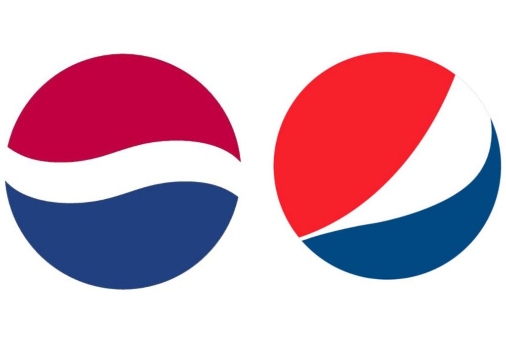
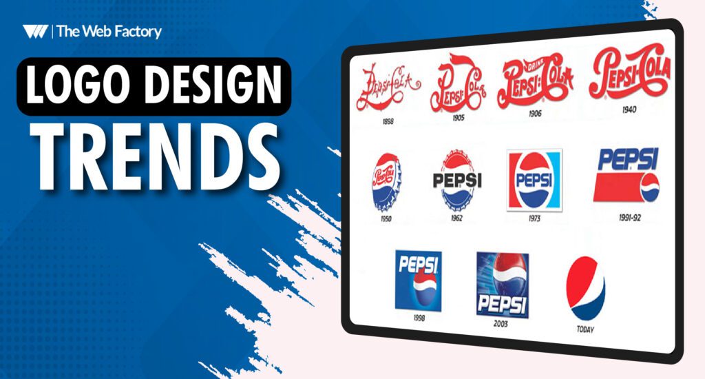
The new Pepsi logo (the one on the right) evolved from asymmetrical design to a more lively asymmetrical form, with the red area dominating over the blue but with white in between.
Negative Spacing
The white space in your logo is also known as negative space. Negative space, often known as white space, is typically just empty space in your logo. That white space may be used for a variety of purposes, including creating a “setting” for your logo’s focal point and balancing its composition to keep it from being packed.
Empty space may also represent a brand characteristic such as assertiveness or transparency. However, in 2022, you’ll see more logo designers using blank space in ways you’ve never seen before, such as treating it as a blank canvas to fill in various ways depending on where and how the logo is used.
Blurred Logos
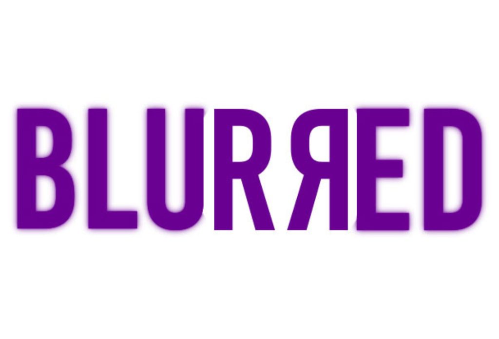
Does it sound weird to your ear that companies are going for blurred logos as well? We sincerely hope not. Because, in 2022, designers experiment with blur effects to highlight fluidity and movement rather than focusing simply on readability in 202. Thus that will be a much lesser emphasis.
Only the borders of the characters may be blurred, leaving the main body of the word visible. Alternatively, you could pair the blurr logo with a written version of the brand name to give the reader a complete picture of your brand identity.
Adding a blur effect to your logo is both engaging and memorable, and it also allows you to include animation.
These logo design trends are being followed widely in the design world. Business owners are either revamping their logos following these trends to reflect their businesses or opt for a logo design service to do it for them. These are some evergreen logo designs that have been around for decades, either known or forgotten, but they are making their way back up lately. So, you wouldn’t want to miss out on them when you revamp your brand logo!

 Typography