If you are into basketball or sports in general, you must’ve heard of the Los Angeles Lakers, right? As remarkable as the history of this team goes — so does the history of the Los Angeles Lakers Logo Design.
The Los Angeles Lakers are one of the most well-known basketball teams in the United States, having won 16 NBA Championships. The Staples Center is where they play their home games. Forbes awarded the Lakers the second most valuable brand in 2015.
The Detroit Gems were created in 1946 as a minor league baseball team (Gemstone). The Detroit Gems finished their brief foray into the genuine sport in 1947. The opponents’ lowest average scores & points for the match in the 1946/47 season pointed to the team’s lack of positive outlook.
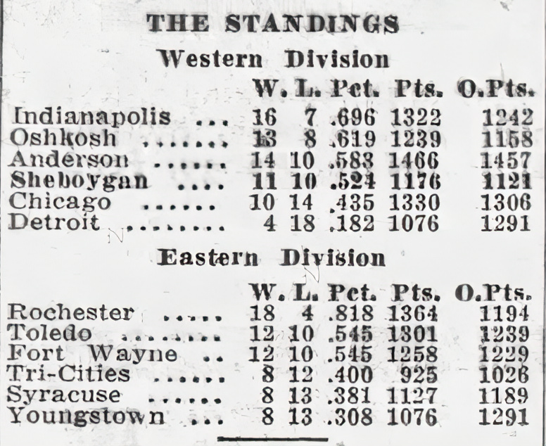
After a year in Detroit, the club relocated to Minneapolis, Minnesota, and became known as the Minneapolis Lakers. C. King Boring, the team’s owner, agreed to sell the franchise rights to franchisees. His Minnesota-born partners, Ben Berger and Morris Chalfen paid a modest $ 15 thousand for the rights.
The Lakers, based in Minneapolis, have been around for almost 7 decades. According to Forbes magazine, this is one of the most well-known NBA teams and the most costly.
The Los Angeles Lakers logo and identity were altered due to relocation from Minneapolis. The players’ t-shirts were decorated with a bright yellow emblem. Furthermore, The club redesigned and established its ultimate look after relocating to a new city.
Los Angeles Lakers Logo History
Despite the fact that the Lakers have been associated with Los Angeles for the most of their existence, the franchise was founded in Minneapolis. It was given the moniker “Lakers” in honor of the state more than 10,000 lakes.
The original Lakers logo included a map of Minnesota, the team’s initial homeland, on a brown and black basketball shape, with a yellow star on the map representing Minneapolis’ real physical location.
The map also had the wordmark “MPLS,” which included a star at the top and bottom and the word “Lakers” at the bottom.

Los Angeles Lakers Logo Evolution
In 1960, the Lakers departed Minnesota and relocated to Los Angeles, California. The Lakers opted to rebrand after moving from one state to another, as most teams do when they relocate.
The franchise ditched the word “Minnesota” in favor of “Los Angeles” but preserved the word “Lakers,” renaming themselves the Los Angeles Lakers. By 1961, the team had adopted the classic LA Lakers logo design, which consisted of a red-purple wordmark above a greenish basketball.
The club made minor color changes to the logo in 1976/77. The text was changed to light purple lilac, and the ball’s green was changed to yellow. The basketball’s seams were also reversed to face the opposite direction, and a darker edge was added to make the design more distinct.

Over the years, The Lakers’ logo design changed according to the club’s suggestions or relocation. The 4th logo design made in 2002 continues to date.
In 1960, the Lakers departed Minnesota and relocated to Los Angeles, California. The Lakers opted to rebrand after moving from one state to another, as most teams do when they relocate.
The franchise ditched the word “Minnesota” in favor of “Los Angeles” but preserved the word “Lakers,” renaming themselves the Los Angeles Lakers. By 1961, the team had adopted the classic LA Lakers logo design, which consisted of a red-purple wordmark above a greenish basketball.
The club made minor color changes to the logo in 1976/77. The text was changed to light purple lilac, and the ball’s green was changed to yellow. The basketball’s seams were also reversed to face the opposite direction, and a darker edge was added to make the design more distinct.
1948 — 1960
The initial logo design for the Minneapolis Lakers logo was an iconic logo design and pretty appealing. It symbolized the emergence of something fresh in the basketball world. The original logo was used when the team was known as the Minneapolis Lakers.
The designers illustrated the Minnesota state boundaries within the circle. They marked the city of Minneapolis with a little five-pointed star, resulting in a basketball that appeared like a globe.
The acronym “MPLS” is shown above, with a dotted mark at the end and two huge stars on either side. The term “LAKERS” appears below.

1961 — 1976
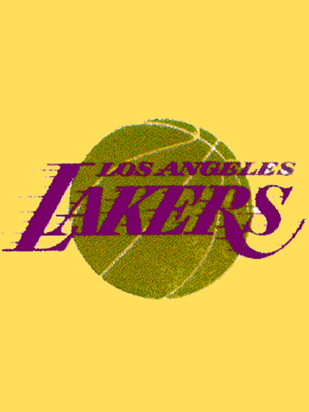
The logo underwent a complete transformation once the Lakers relocated to Los Angeles. The ball lasted, but it turned deep green and grainy color, similar to lawn grass. The name of the club has been relocated to the middle.
The purple text “LOS ANGELES LAKERS” is split into two lines and framed in a unique way: thin lines reach to the left from the last word. This gives a motion impression when used with an italic font.
1977 — 2001
The team’s primary colors were altered after nearly 30 years of existence. The ball’s major lines, which were once white, have now become black. Other hues have shifted as well: green has become orange, and dark purple has become light blue. The ball’s seams began to move in the other way.
The Lakers’ logo was redesigned in 1976/77. The ball was given a black outline, which helped to make the pattern more visible. The colors were also tweaked a little. The basketball’s gold became more golden, and the red-purple was changed with a light purple lavender.

2002 — Present
The logo underwent a complete transformation once the Lakers relocated to Los Angeles. The ball lasted, but it turned deep green and grainy color, similar to lawn grass. The name of the club has been relocated to the middle.
The purple text “LOS ANGELES LAKERS” is split into two lines and framed in a unique way: thin lines reach to the left from the last word. This gives a motion impression when used with an italic font.
Los Angeles Lakers Logo Elements
The initial logo design for the Minneapolis Lakers included a basketball and the team’s name. Apart from the color modifications, the placement of the wordmark, and the shift from “MPLS” to “Los Angeles,” the present logo is quite similar to the original.
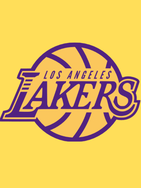
The present logo, which has a basketball with prominent traced seams, the complete word Los Angeles Lakers printed over it in purple, and motion lines flowing out from it has become one of the NBA’s most identifiable logos.
The Lakers Emblem
The visual centerpiece of the Lakers logo is the distinct wordmark. The logo, which says “MPLS LAKERS,” now reads “Los Angeles Lakers” in dark purple.
Unlike the original design, this message is positioned directly on top of a gold basketball instead of above and below it. The colors pop more because of the black outline, making the symbol stand out.

The Lakers Logo Font
The “Bodoni” typeface is used in the Los Angeles Lakers logo. The club did not purchase the right to use this font.
However, they did purchase the permission to utilize it. The font type is a serif font, italicized and embellished with ornamental embellishments.
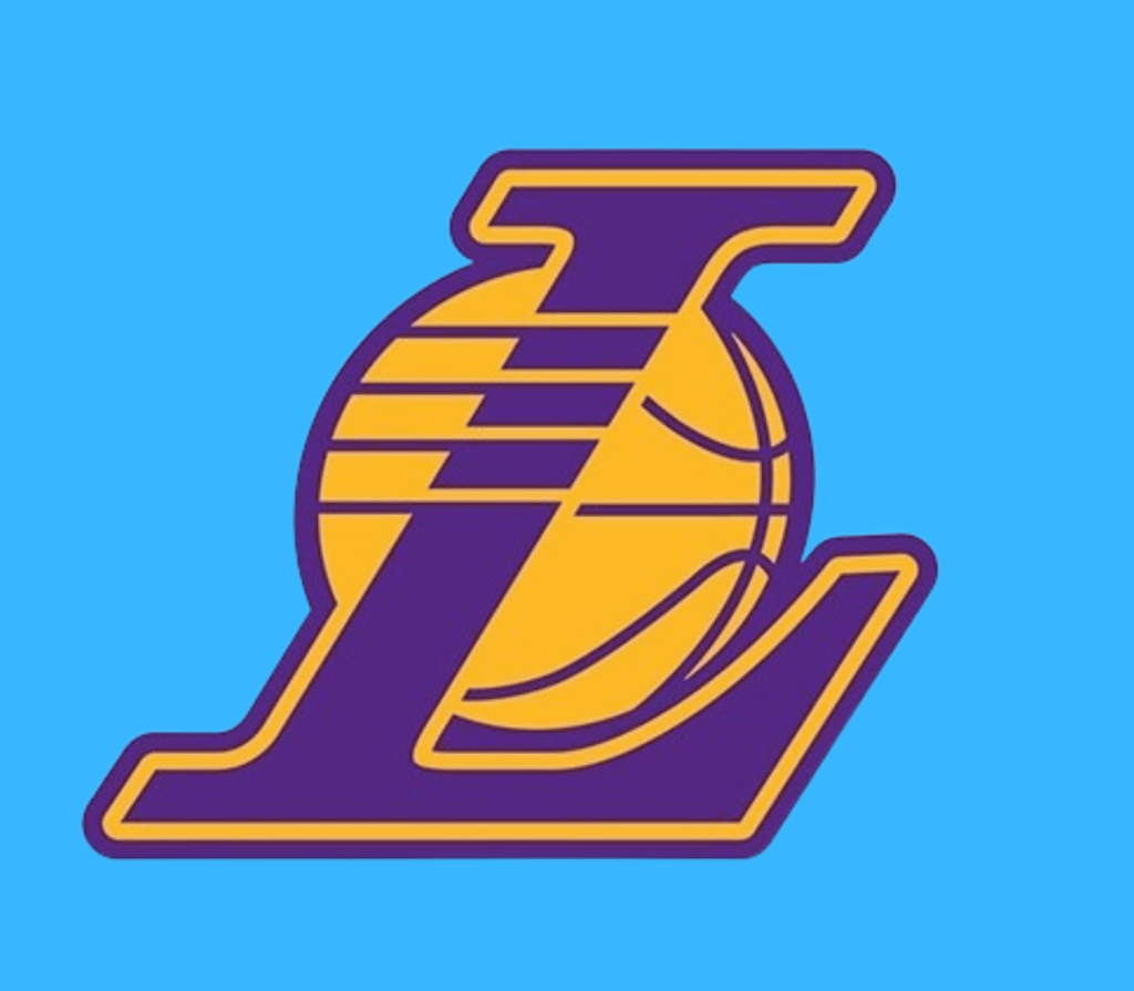
Since 1961, the club mark’s form and dimensions have not been altered. A basketball with uniquely drawn seams sits proudly in position, with the complete name Los Angeles Lakers printed across it as it did previously.
The logo is energetic and identifiable because of the numerous horizontal lines that run from the characters in the word “LAKERS.”
The lines that reach out horizontally to the left are one of the most unusual graphic features of the wordmark. These “motion lines” appeared in the initial iteration of the logo, which was designed in 1960.
The Color Palette
Since its inauguration in 1960, this iteration of the Lakers’ logo has undergone several color modifications. Purple, gold, and white are the team’s primary colors at the moment.
This palette, which is also used on the team’s jerseys, was first established in the 1960s & has seen only minor color changes since then.
The current design incorporates the colors of all three teams: purple, gold, and white. There’s also a smidgeon of black to contribute to the visual balance.
In the late 1960s, the Lakers chose this color palette, which is also utilized on their jersey. Since then, only minor color changes have occurred.

Final Word
Even if you aren’t a basketball fan, you certainly are familiar with the Los Angeles Lakers. They are one of the most decorated and competitive teams in the NBA to date.
For decades, the team has been distinguished by a single logo, frequently hosting famous stars and even larger games. When you look at how the Lakers logo has developed – or hasn’t – you can understand its importance to the team’s identity.
Ever since the club has come into existence, the Los Angeles Lakers have displayed its distinctive logo prominently. The basic yet familiar logo of a purple “Los Angeles Lakers” wordmark above a gold-colored basketball has remained virtually unchanged for decades, with only minor color and font variations.
The “Los Angeles” logo has been the visual centerpiece of the Lakers logo ever since the 1960s, whereas the gold basketball has undergone slight color variations throughout the years.
The previous logo makeover occurred in 2001 when the emblem was given a black border and more vibrant colors, making it stand out even more. The Lakers logo has stood the test of time. The minimal design features are timeless and do not appear to be out of date or part of the new ethos.
The way the design was put together was probably foreshadowing, yet it still manages to be one of those logos that appears tough to change. There’s a considerable possibility you’ll find it here if you’re seeking perfection in logo design.
The LA Lakers Logo and the Lakers have been one of the most prominent sports teams in American sport, despite being decades old and still running strong.
With their iconic logo design since 2002, the Lakers can only go up from here, with a roughly estimated $1 billion value, many NBA records, and an endless lineup of very skilled players.
That is all for the Los Angeles Lakers logo design history and evolution. If you want your logo to last for decades just as theirs, The Web Factory’s logo design service can help you achieve that goal. We provide one of the best logo design services in the US. Feel free to contact us, and we’d be happy to assist.

