The National Football League logo has been recognized as an iconic emblem and its armor since the formation of the confederation in the 1920s. The shield, inscription, and stripes of the flag of America in the NFL Logo Design are quite popular and renowned with American professional football fans worldwide. Although there have been a few changes to some components of the NFL emblem, the overall notion has remained the same over the years.
A New Football League Is Born

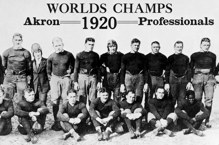
Ten teams were initially part of the National Football League (NFL) venture when it officially emerged in the 1920s after years of defeated attempts.
There remain just two teams among the founding teams who still actively participate in the league; Arizona Cardinals and Chicago Bears. At present, NFL comprises 32 teams participating across four main American regions. Earlier in the 1940s, the logo used pink for the stripes and the ball above the inscription. The emblem has acquired the U.S. flag’s blue, red, and white colors. However, the idea of stripes on the ball symbol was made redundant in 1962 for a crisp look of the logo.

The current emblem depicts a narrow shape of the uppercase letters using a comprehensive custom serif font, with the letter “F” pulled slightly below the ‘N’ and ‘L. A truly classified football league was established in September 1920 by sports enthusiasts and was called the American Professional Football Association. The league’s inaugural season comprised ten teams hailing from four states. The league’s name was changed to the National Football League in June 1924.
An American Indian, Jim Thorpe, first visualized the idea of the NFL. He was previously an Olympic athlete who was also a player-coach then and the owner of Rochester Jeffersons, Leo Lyons.
Due to the outbreak of the Spanish Flu in 1918 and World War I, many players weren’t available, and teams had to temporarily shut down their operations worldwide.
The NFL became more stable and organized during the 1920s and 1930s as its membership increased. Teams prospered as the league gained popularity among the youth after the Second World War in 1946. The championship game played in 1958 was labeled “The Greatest Game Ever Played. ” Soon after, the league became one of the country’s most popular for decades to follow.

The league expanded to 13 teams in 1950 when the Baltimore Colts, the San Francisco 49ers, and the Cleveland Browns joined. The NFL also expanded to the Midwest and the Eastern Coast.
The game got speedier and more high-scoring after World War II when the league started competing in college football events. Soon after, NFL started getting featured on national television, making football a recognized sport nationwide.
Evolution of the NFL Logo Icon
The NFL logo icon has undergone decades of changes to upgrade the symbol to the most appealing one. Due to several revisions in the past, the current logotype looks more classic than the ones designed earlier.

1940 till 2008
The update to the 1940s NFL logo gave it a more refined look and became a starting point for future reiterations until its finalized version launched in 2008. A major change during the 1961 – 1982 period in the emblem was eliminating the red stripes at the back of the “NFL” text. Slight alterations, such as thickening of the shield’s border, were made from 1983 to 2007.
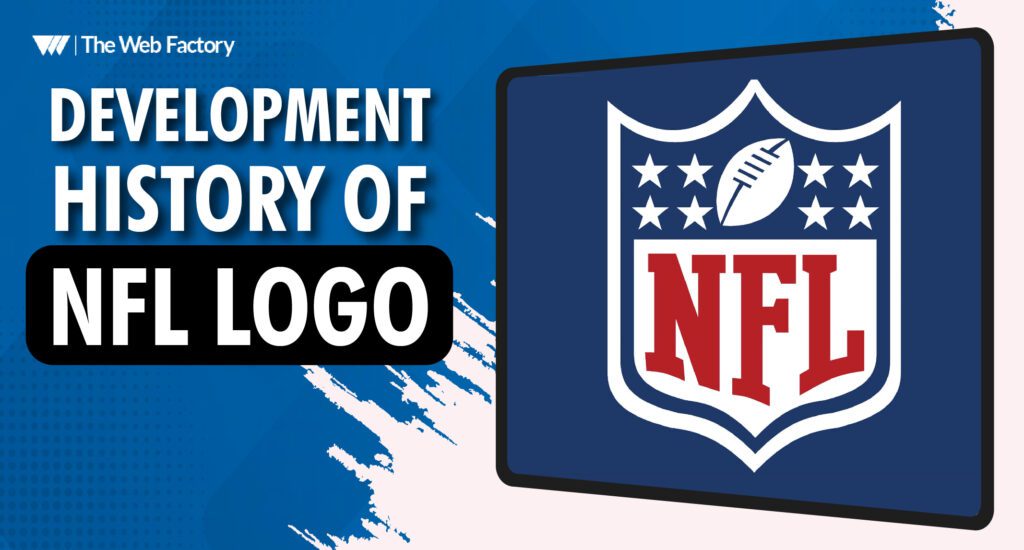
Each element was updated when the National Football League logo was redesigned at the beginning of the 2008 season. The number of stars in the shield was reduced to 8, one for every division. The oval ball’s outline was repositioned, and the NFL logo font was replaced with a straight-serif typeface.
Components of the NFL Logo Design

The NFL team logos stand out from other sports league logos because they depict a sporty element that communicates brilliance and honor.
Appearance And Shape:
The shape of the shield acts for the highest standards of sports entertainment and the league’s commitment. Apart from being a certitude stamp, it also represented and got its inspiration from the league’s founder’s union with being an American national.
NFL Logo Colors:

At present, the NFL emblem uses the blue, red, and white colors of the U.S. flag. The shield is royal blue, while the logotype is red on a white background.
NFL Logotype:
The NFL logo typeface uses the ‘straight serif’ font, which looks quite similar to the renowned “College” font.
NFL: The Contemporary Period

The National Football League earned its spot as an important part of American culture and a top spectator of the country’s sport after it was initially aired in 1970. For years, the Super Bowl was rated as the best television sports and entertainment program and was made an unofficial national holiday.
Final Thoughts
The NFL logo evolved into American football’s most popular logo design, and the National Football League has become the most followed sports league and a globally well-known brand.
American football is one of the wealthiest sports leagues globally due to the popularity gained from television broadcast agreements. The iconic Super Bowl and various live sporting events have played an integral part in bringing a healthy change to American culture.
Adapting to the present times, the NFL logo has drastically evolved since its first design and has maintained a balanced brand identity throughout the years. We particularly appreciate the revolutionary change the NFL logo underwent. Get in touch for similar glorious and unique logo design services for your brand.


