We’re all well acquainted with the timelessness and simplicity of the Nike logo design. With a net worth of about $34.8 billion, Nike is one of the best-renowned sports brands globally and has built its brand awareness over the years owing to its distinctive emblem design.
The $35 creative Nike logo design, sketched by graphic design student Carolyn Davidson in 1971, took the world by storm.
The Concept Behind The Nike Swoosh Logo
The Nike logo design doesn’t leave one amazed at first sight as the emblem is that of a simple black tick bearing Nike’s “just do it” tagline. Despite this, the Nike swoosh has a deeper meaning.
Representing the wings of Nike – the Greed goddess, the brand’s swoosh emblem gives out the message of victory, delivering power to warriors on the battlefront.
The unique Nike logo design is perceived as contemporary and expeditious, unequivocally leaving a positive impact on the viewer’s mind. The creative Nike emblem has a minimalistic design standing the test of time while promoting aspiration and capability.
Components of the Nike Logo Design
The Nike logo font and other design components:
Structure:
Though people view the Nike swoosh as just a simple checkmark, it represents the Greek Goddess Nike’s wing which Carolyn wanted to imitate in her design.
Color & Tone:
The colors Red and White are associated with Nike and its history. However, the swoosh comes in a range of colors.
Typeface:
The Nike logo font used is the ‘Futura Bold’ font, and ‘Nike’ is in bold upper case, emphasizing the brand. The letter ‘K’ is slightly tilted to increase visibility.
Bear in mind that Nike’s logo and font are not always linked. Some Nike products will have the word ‘Nike’ imprinted along with the logo, and some material will have the phrase “Just Do It” displayed.
Standalone logos:
Nike designs individual logos for certain product lines. The Nike Skateboarding emblem has an “SB” under the checkmark. The Nike Air logo has the word “Air” under the Nike swoosh.
Nike Logo History
The Nike logo design still stands out as the most unique and recognized emblem worldwide.
Nike’s image of positivity and resilience is conveyed through its logo and its attested shape, which depicts a sense of perseverance for present-day athletes.
The company is famous for its propensity to remodel anybody into an athlete as the symbol is an inspiration for those who want to accomplish their goals.
Surprisingly, the Nike logo’s evolution originated from a suggestion from a graphic design student.
The Nike Logo Evolution
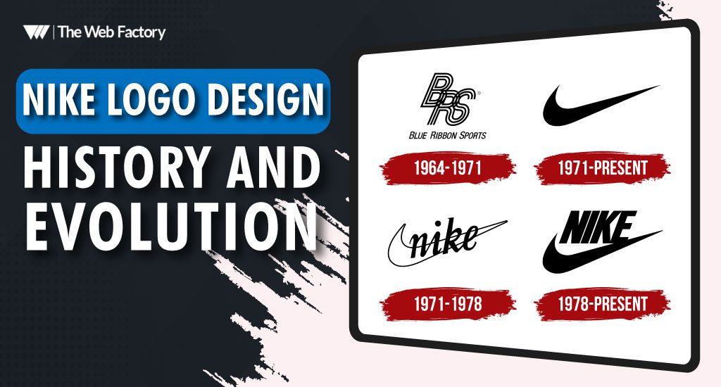
Nike kicked off its operations in 1964 and was originally named “Blue Ribbon Sports.” The logo for the company was simply an assortment of interweaved letters reading “BRS” with ‘Blue Ribbon Sports’ written below. This emblem stuck with the company for several years.

Carolyn Davidson introduced the Nike swoosh in 1971 along with other prototypes, but those were rejected because of their cluttered design.

Although the Nike logo design has been slightly tweaked over the years, the central checkmark remains unchanged.
The sports manufacturing company has often tested adding the word ‘Nike’ to the swoosh logo in addition to its tagline, “Just do it.”
In the initial years of its existence, Nike combined its brand name with its logo to create and strengthen brand awareness.
This is what the Nike logo looked like in 1978:

After 1985, Nike used a red and white logo that many are still familiar with for some time. It wasn’t long before the company shifted back to its conventional logo.

The company promotes various products from time to time using variations of the logo with words and abbreviations added above the checkmark.
At present, the Nike logo design is minimalistic, with simply a swoosh, without the brand name or tagline. Owing to its brand recognition, the Nike symbol is recognized worldwide without mentioning a name, making it the number one brand in the world.


